|
Drafting:
Before painting, and especially in the case of commissioned murals, I will design a work as completely as I can.
Most geometric objects that rely on linear perspective are drafted and are plotted in 3 dimensions, including light sources and shadows.
The design is then redrawn onto the canvas using graphite, charcoal or carbon pencils.
Scenes in my paintings are nearly always simulated rather than painted from life or copied. Even if I have good reference
material, it is usually impossible to copy something verbatim, and I will have to reconstruct it.
The exception to this is if I'm adding organic elements, such as people, cloth, etc.
If I am able to position and light them correctly, I can either paint from life or photograph it and copy it to the painting.
I use the same technique whether painting murals or easel work.
|

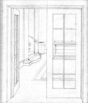
Pencil draft of 'Foyer'
Move your mouse over the image to see the finished mural.
|
Perspective:
The perspective in most of the murals has been calculated to look right from a single viewpoint and is one of the most important elements.
From this viewpoint the trompe should blend seamlessly with the existing architecture and all the objects in the mural should look like they would if they were there in real life.
If one were to move closer to the mural, the image would look more like it was seen through a zoom lens, and if further away, like a wide angle lens.
In any case, if the viewer is not near the optimal viewpoint, the mural will look more like a painting rather than a trompe l'oeil.
Restricting the viewing position can be achieved in several ways:
One way is to have the mural initially seen as the viewer enters an area, possibly through a door. In this case the trompe creates an initial impact.
Another way is to have the viewing position in an area where people will most likely frequent. A lounge or dining area would be appropriate.
The perspective in my easel work is similar to the murals in that there is a viewpoint directly in front of the painting
but one major difference is that I'm not bound by having the horizon at eye level.
When painting on canvas, I can simulate looking up or down, bringing 3 point perspective into play.
In either case, my objective is to let the viewer look around in a painting as if they were looking around in real life,
hopefully allowing them to feel like they are looking into another world.

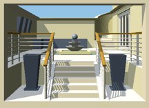
Software draft for Modern Courtyard.
Move your mouse over the image to compare it with the finished mural
|
Software:
I have developed software to handle linear perspective. It is constantly in a state of development and is not commercially available.
It allows me to plot points in 3 dimensions, and store them along with planes and vectors.
(Points are stored as x, y, z coordinates and are displayed as x, y coordinates relative to the edges of the painting.)
Three or more points on a plane can make a polygon, and multiple polygons can create more complex objects.
Rendering these polygons to the screen is a relatively recent development which has allowed me to design the basic elements on a computer rather than paper.
Medium and Materials:
Murals
For murals I use Solver Brite-Glow low sheen acrylic paint, (no longer available), which is made specifically for signwriters
and scenic artists. It is an Australian made product.
It comes in tins and is similar in consistency to normal house paint,
but rather than being tinted from a base colour, it is coloured with pigments.
This results in a tougher film and longer lasting colour when exposed
to the elements.
Airbrush:
I use a Paasche VLS airbrush as blending acrylic is a nightmare for me because it dries so quickly.
The airbrush is driven by a SIL.AIR noiseless compressor, a small Italian
portable compressor with a membrane around the piston which is filled with oil to suppress the noise.
Easel Painting:
Most of my paint is made by 'Art Spectrum', but I also use 'Williamsburg', and 'Langridge'. Art Spectrum and Langridge are Australian brands
I prefer to paint in opaque layers rather than translucent, but the paint is often thinned with glazing medium. At any rate, the paint is spread thinly so the surface of the paint has no raised edges or brush marks.
Canvas:
Canvas is usually 12 oz or 14 oz cotton or linen on cedar stretchers and primed with an acrylic based ground.
Thinners and Medium:
When using acrylic, the only medium I use is water, and brushes are cleaned with mineral spirits, or acetone.
For oils I use the same medium throughout my layers, made of stand oil, linseed oil, odourless mineral spirits, and a little bee's wax.
[Edit: Recently I have been using the medium without solvent and I prefer the way it handles, although if I'm painting long thin lines, or very hard edges, I find adding a little solvent is neccessary].
After the solvent has evaporated from the surface, the wax sets and makes the paint a little more viscous, giving it a buttery feel.
It gives the surface a satin sheen, and is also effective against paint beading on the surface.
Acetone is also good for cleaning oil from brushes, as well as cleaning brushes when changing between water based and oil based paints.
The mural "Modern Courtyard" (above right) was the first painting that was designed in this way.
Move your mouse over the image to compare it with the finished mural.
The draft includes shadows although the software wasn't able to render shadows at that time, and they had to be calculated manually while painting the mural.
|
